AnnAlia Young, my coworker, asked me to Create labels for Two new Holy Honey products that the sisters put out for their yearly holiday boutique: hand cream and lip balm.
For the hand cream, I looked at many different label designs currently out on the market, and put together a set of drafts for her and the sisters to choose from to see if they were leaning towards a particular one.
In this case, I tried to make two designs that didn't have a seal option and two with a seal option, in case they wanted to have something for safety purposes.
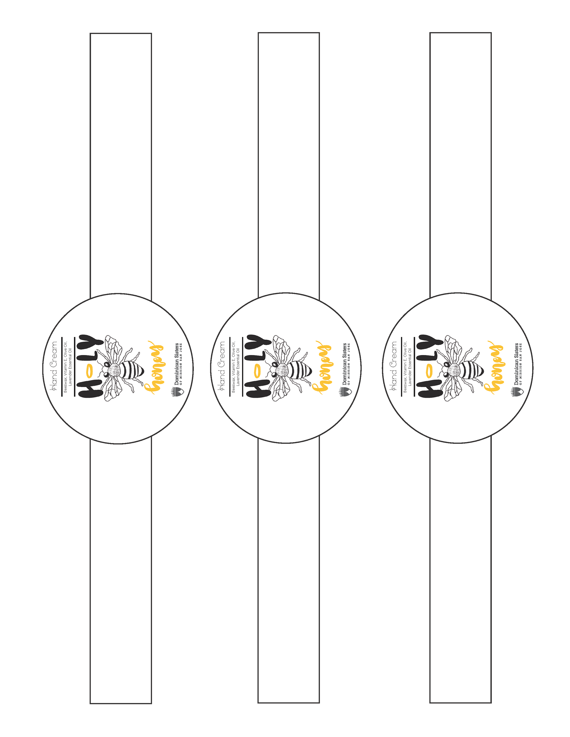
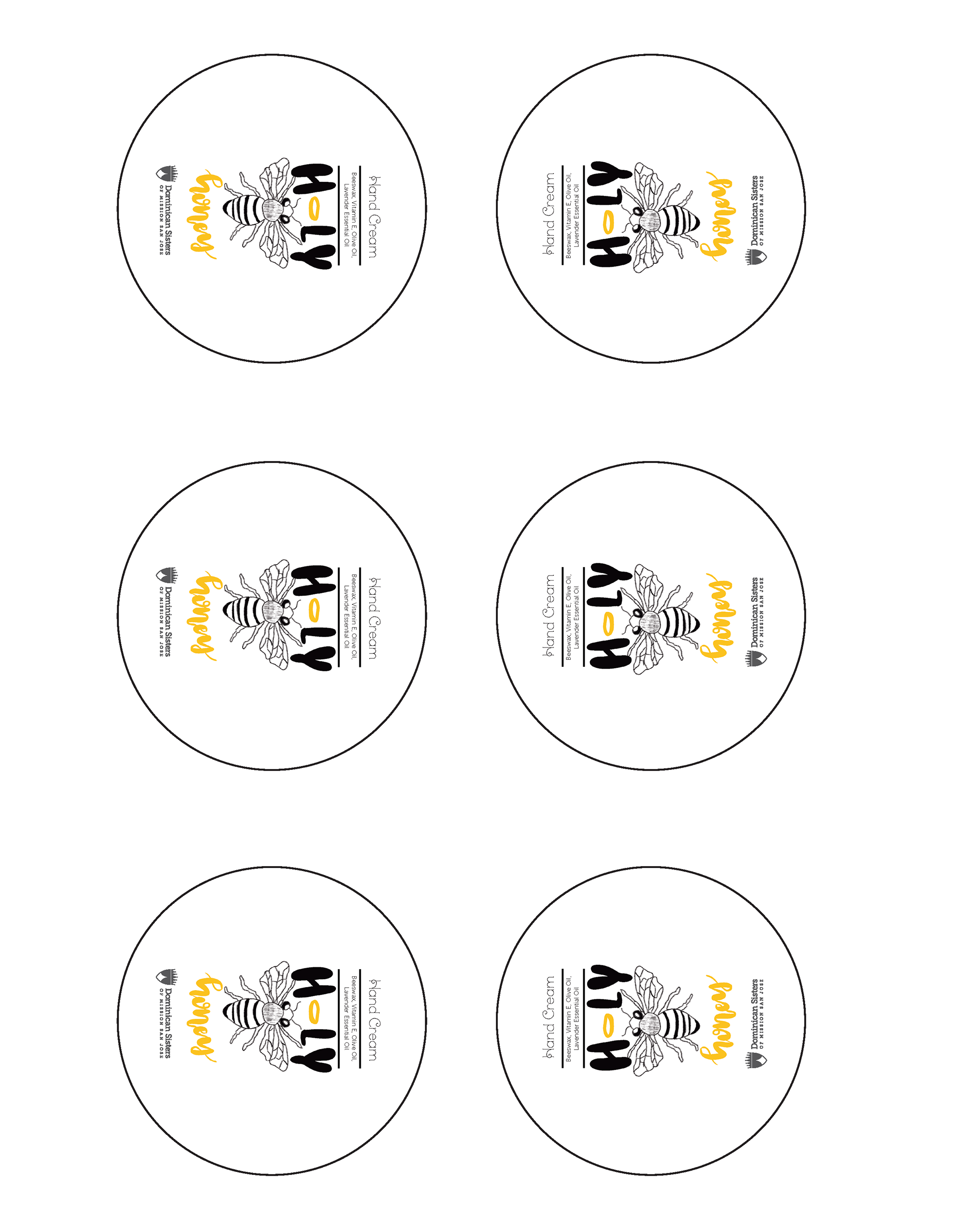
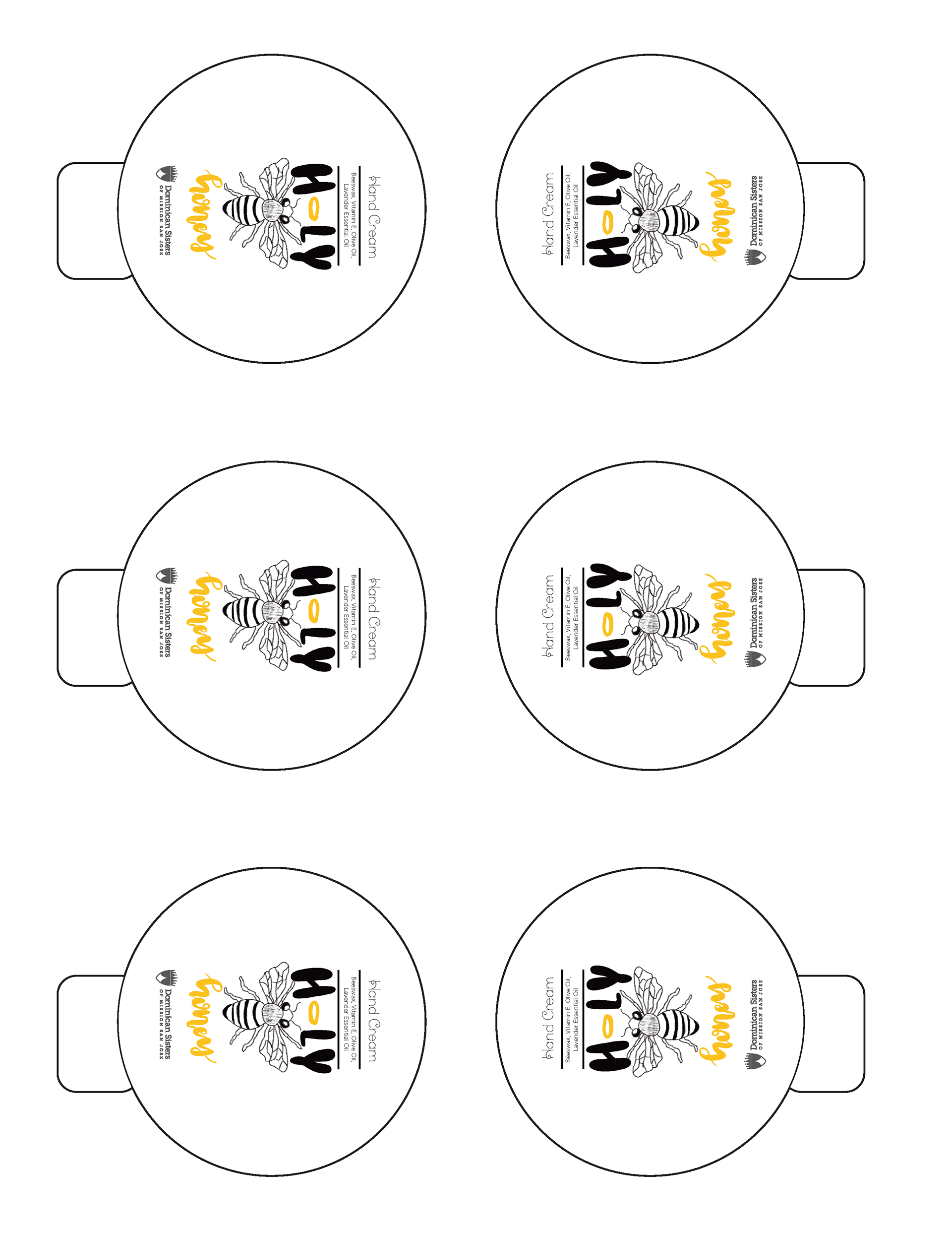
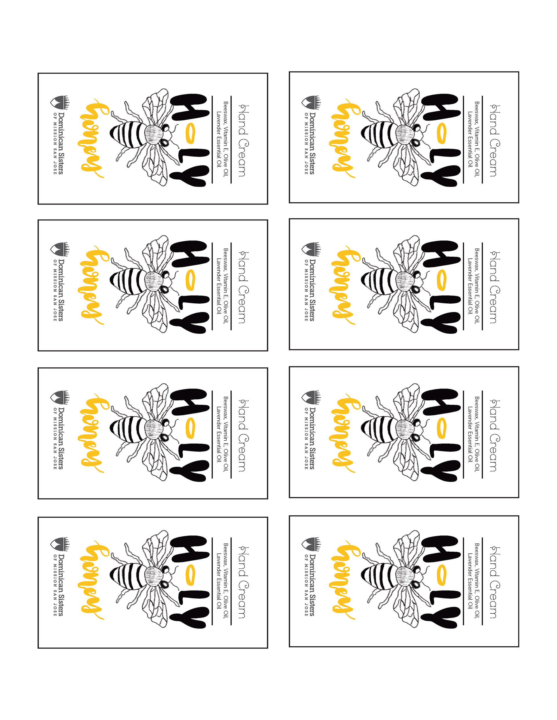
After receiving the feedback from annalia and the sisters, it was clear that none of those designs were going to work with the vision they had in mind, so it was back to the drawing board. Eventually, with guidance from annalia, I settled on creating a smaller square label and a separate seal design. the font style changed as well; we went from having two different fonts to just using one for the entire label.
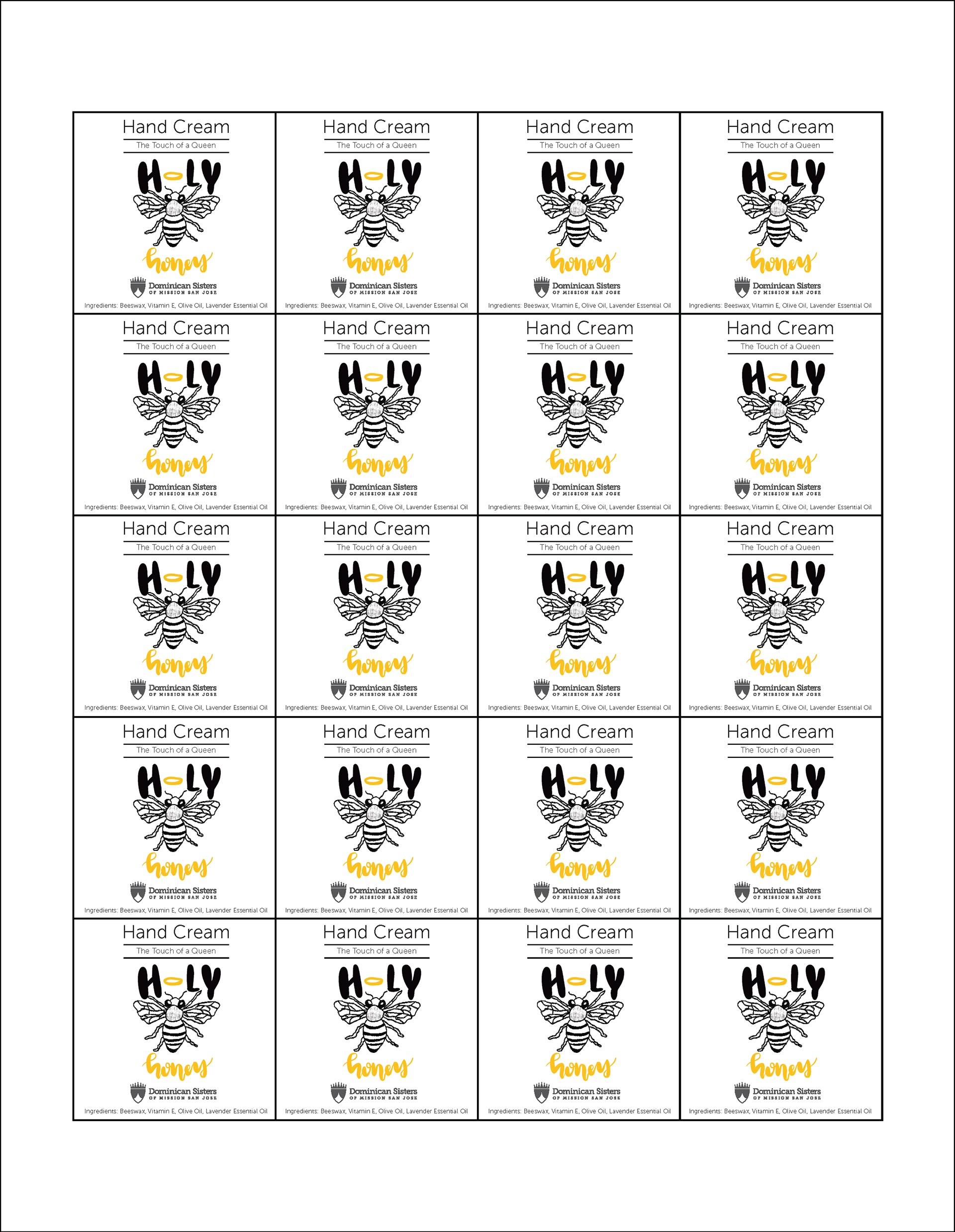
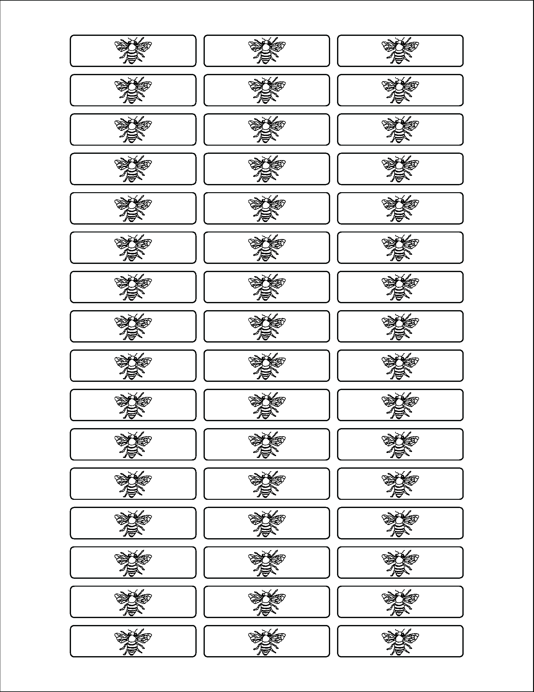
After receiving edits from annalia on adjusting the text weight in the "Hand Cream" part of the title of the label, along with making the bee design a bit darker for contrast and rotating the bee in the seal design, I came up with the third draft of the label and seal.
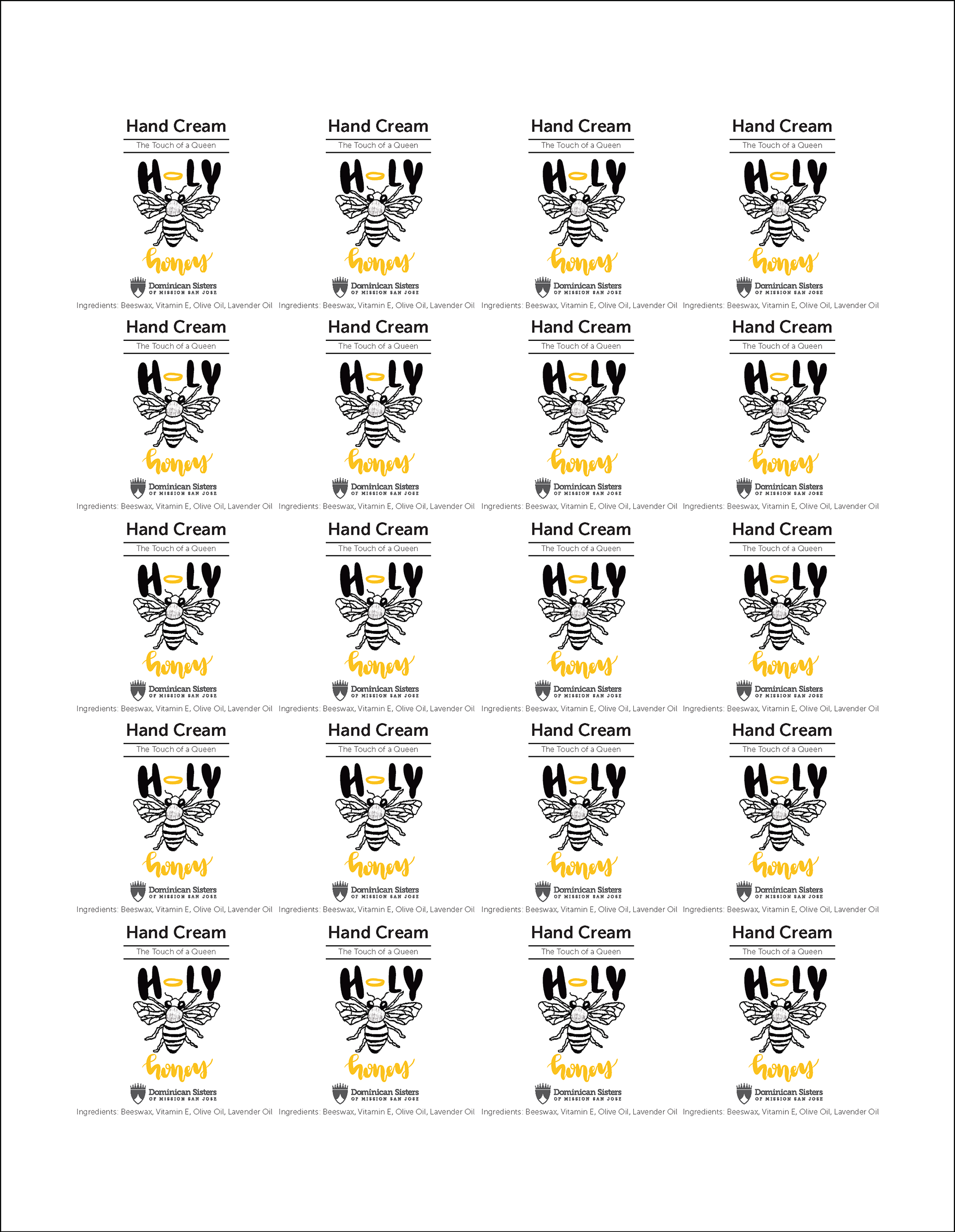
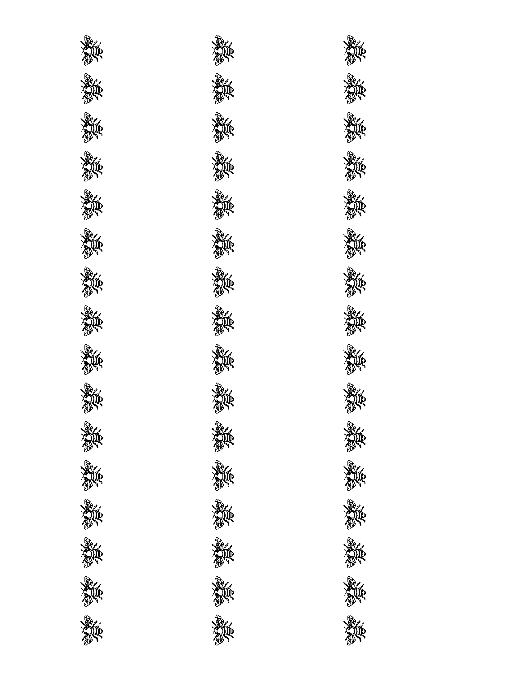
The final design involved moving the ingredients over to the seal design so that the hand cream label could utilize its space even more. Below is what both labels looked like in digital before being sent off to print.
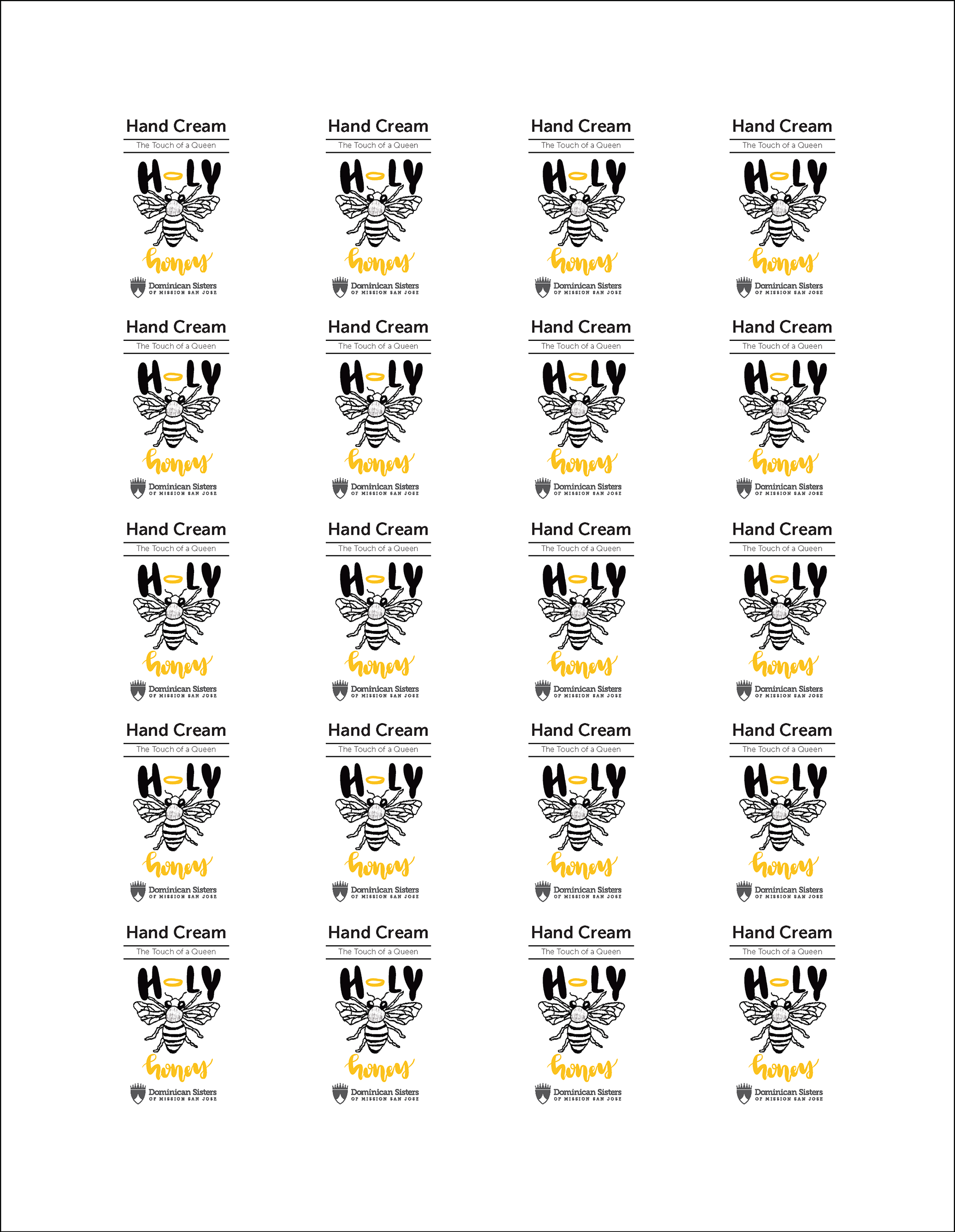
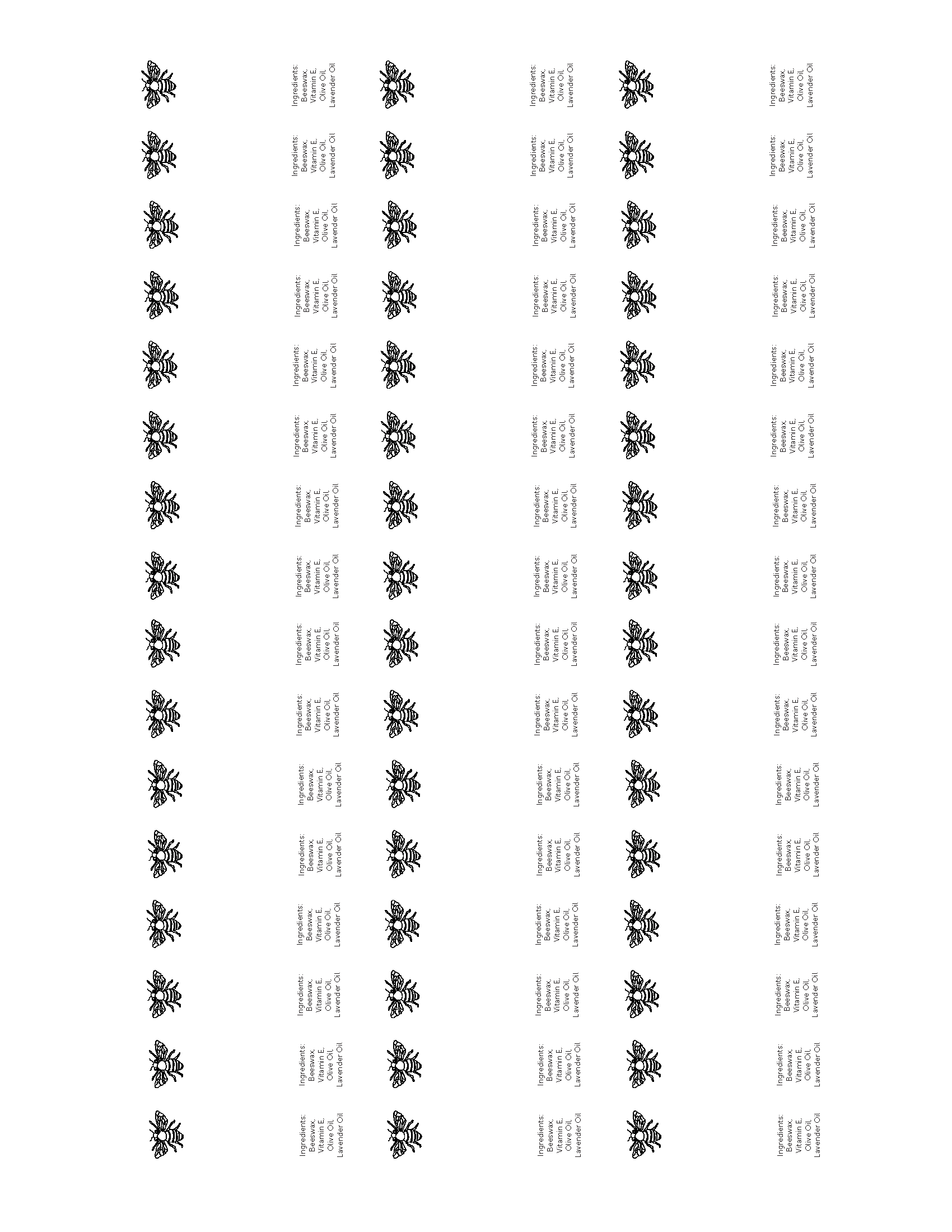
For the lip balm, the idea was to have it match the branding of the hand cream, and to have the design fit on the label with enough breathing room around it for print. This initial design was a bit of a challenge for me, as I had never previously designed anything for lip balm before.
I did some research and landed on the initial design below.
After receiving edits, adjustments were made to the orientation and sizing of the label and its accompanying text.
The next idea Annalia suggested was to change the orientation of the ingredients text and move the placement of the ingredients to right below the spot where the safety label would be peeled off.
Some other core adjustments were changing the font weight in the title of "Lip Balm" and the darkness of the bee design to match the hand cream label for branding consistency, along with the Adjustment of the sizing of the ingredients text.
The final draft included adjusting the label placement, taking out the label outline for printing reasons, and adding in the full list of ingredients to the lip balm, which we had not received until earlier that day.
Ultimately, designing these two new labels was a bit of a challenging process for me, as I had not done too much with these sort of products before, but I feel that the final results were solid. I gained a lot of insight into product label design after working on these.
