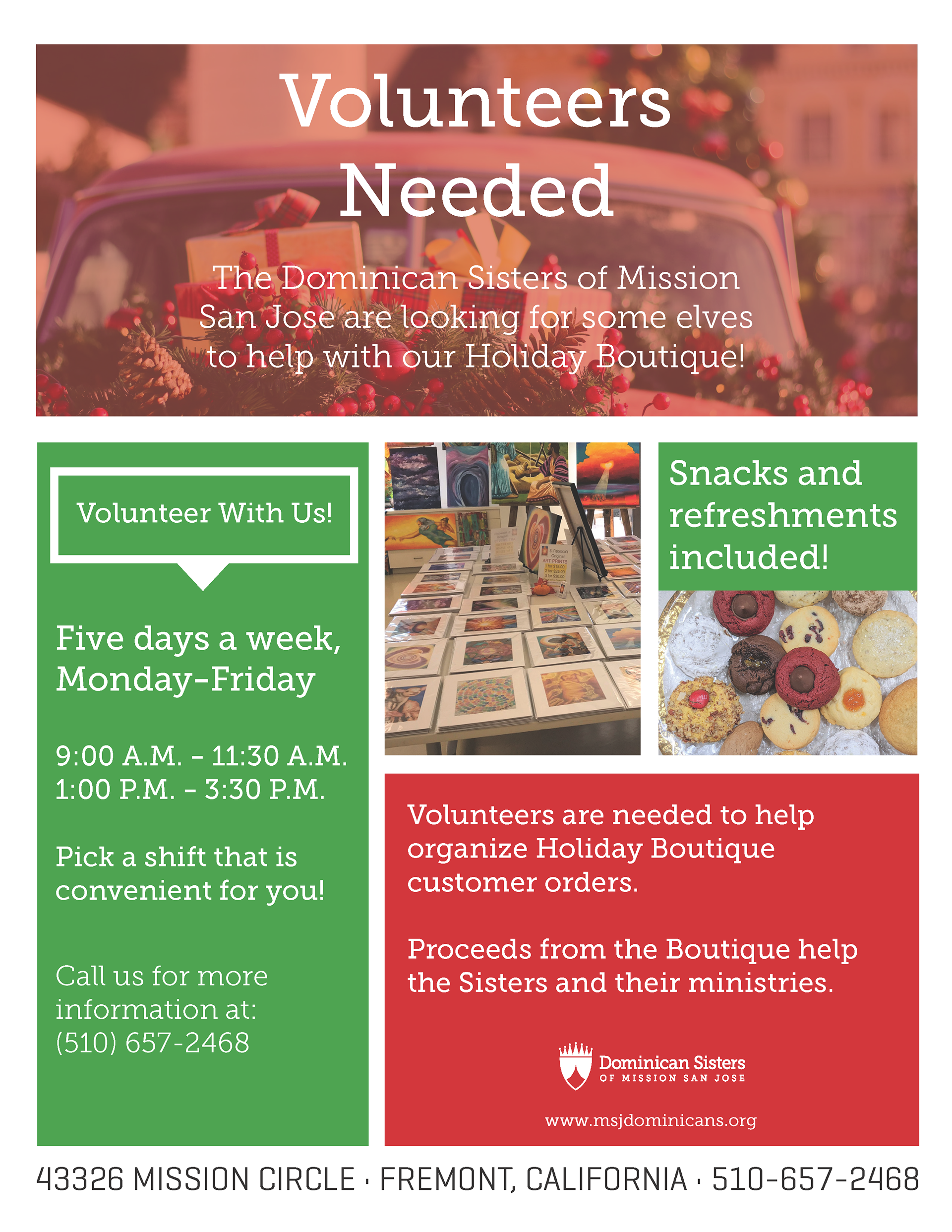
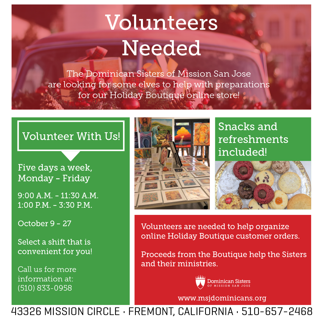
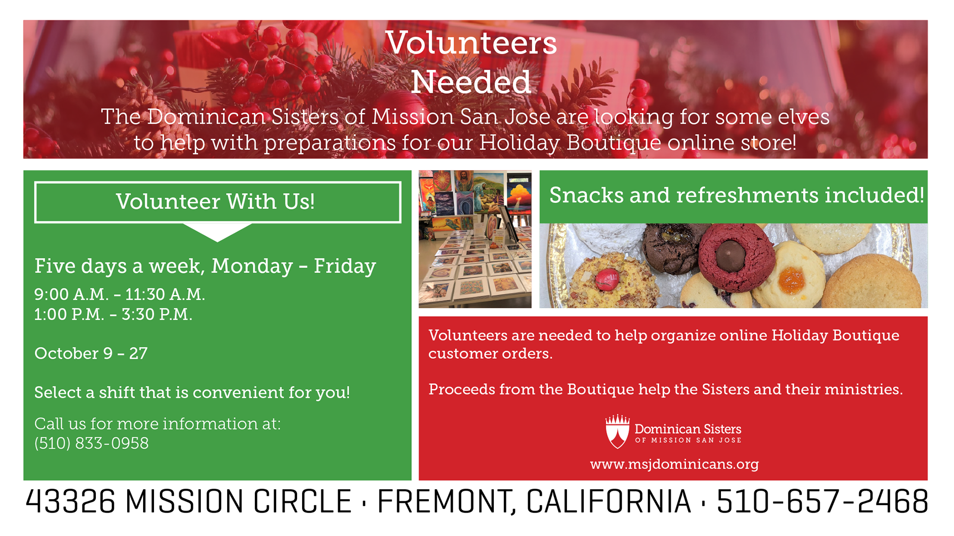
The third assignment I was given from my boss Stephan Pippen was to create a print flyer for the Sisters to try and recruit volunteers for their Holiday Boutique. After being given the specific information that needed to be on the flyer, along with the general layout of what he was looking for, I came up with two drafts that were based on past flyers to stay consistent with their branding.
I wanted to use holiday colors, so I went with red and green, and made the red a lighter opacity than normal to make it easier for the viewer to read the text but still see the festive image underneath.
(The coloring of the images may look a bit odd, because they were created in cmyk.)
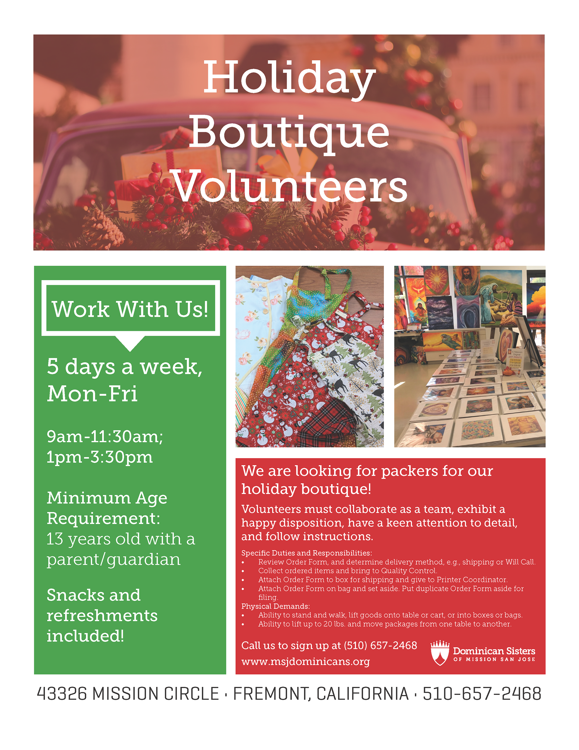
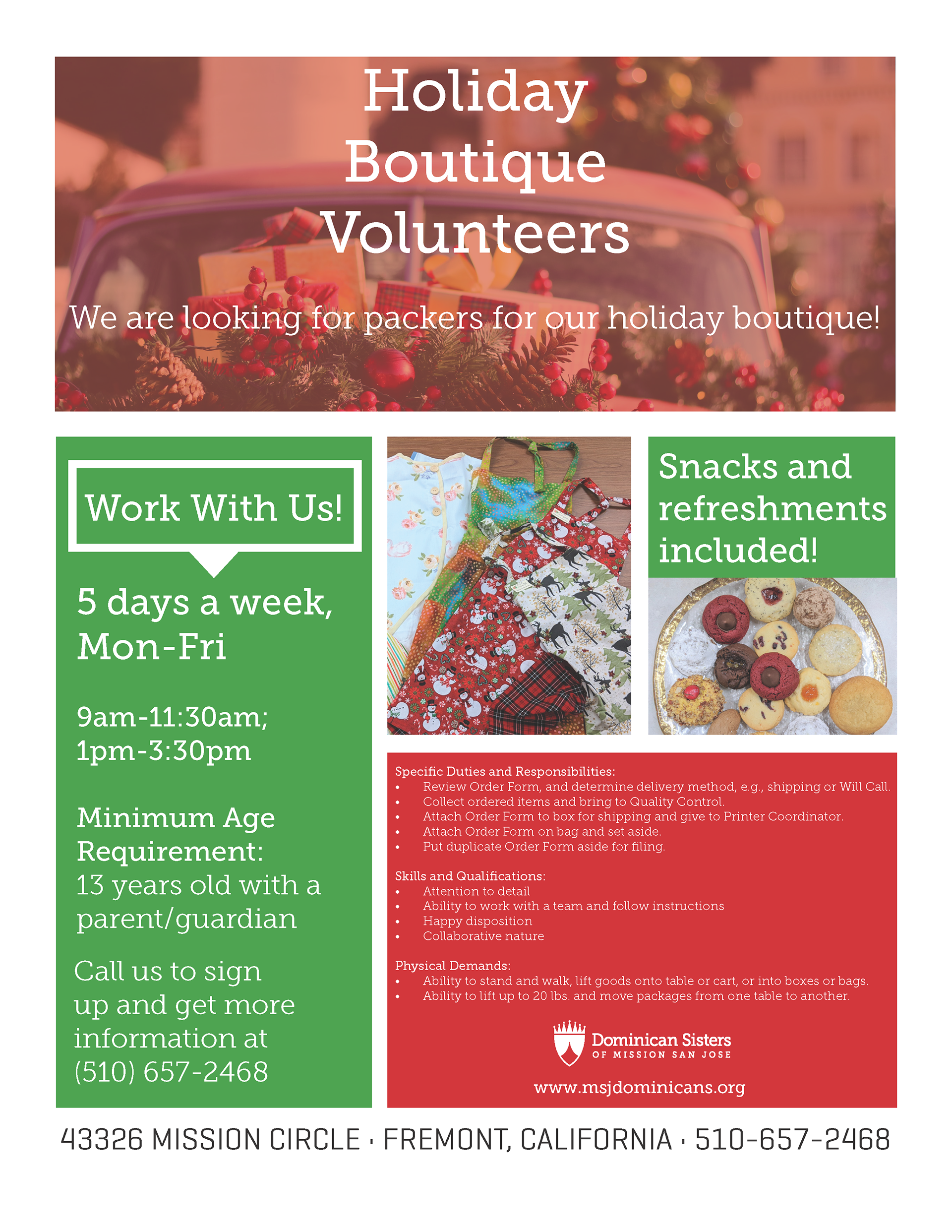
After receiving feedback from stephan, along with some information changes, I went ahead and updated the draft. The core changes were mostly in the red text box in the bottom right-hand corner, because the information was a bit too tiny and would be hard to read from afar.
Once the final edits were sent over by Stephan, I made the final PDf version (the first photo in the collage below), as well as the finalized png versions that they needed for their social media accounts and their website to promote online.
