For this particular project, I was given the task of creating social media posts showing off each of the winners of the 2023 Granite Kids Calendar contest.
It was my first major assignment given to me when I first started working for Granite as their winter MarCom (Marketing & Communications) Intern.
After looking at the previous years' posts that were created by the graphic designer, I firstly decided to make the template for the posts in Canva. This was to make the project turnaround a bit faster, along with making the files easier for the team to find and access after my internship ended. Plus, it made it easier to upload the artwork and headshot submissions we received from the winners of the contest.
Next, I started to consider what sort of animation would look best in the introduction segment of the video template. I referenced the previous years' design, along with looking at some design ideas and general image inspiration on Behance and istock.
eventually, i settled on the idea that a sort of hand-drawn style of animation would look best, and landed on utilizing a calendar "sketching" itself into view as part of the introduction.
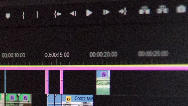
This part of the video took a few iterations to get right - in older drafts, the sketching effect ended up being too slow, or would look good in after effects, but then after exporting turn out extremely grainy.
I made sure to change the top color to the primary color (granite green) to stay consistent with their branding. once I landed on the final draft for the introduction, I moved forward with the rest of the video.
DETERMINING how to display the main information (the quotes from the kids, their names, etc) was another challenge that presented itself.
it made the most sense to take the headshots we had been given and turn them into cutouts to help them fit with the plain white background and help to make the video look clean.
after that, utilizing the negative space around them by inserting their quote about integrity (the theme of this year's calendar) felt like the right thing to do.
Once that was in place, the next steps were to add in the artwork on the next slide, and to then have the video finish with the branded outro for granite.
the transition was a key factor in making sure everything tied together nicely, so I utilized a color gradient effect that included granite's primary and secondary colors, along with a few tertiary ones as well.
the last step in this entire process was picking the right music. This is what would really set the tone and overall aesthetic of the entire series. I eventually landed on a song that felt like the right fit, but listened to it a few times to make sure that it wouldn't be annoying if it was left to accidentally loop.
I also created Instagram reel covers for each month's winner and scheduled the social media posts on hootsuite, along with writing relevant captions and using the correct hashtags.
the Final social media posts are below:
January
february
March
april
May
June
July
August
sEPTEMBER
October
November
December
-Instagram
-twitter
-linkedin
-Facebook
