One of my first major projects that I was given in UC Davis Athletics came from Lydia Sandlin, who asked me to help redesign the old Schaal Aquatics Center posters. Not only were they incredibly sunbleached, but they were hard to read, and had a lot of outdated design elements in them (old school colors, old logos, etc.).
This was a challenge for me at first, as I had never had to redesign something that would have to last for a long amount of time. After mulling over all of the edits she requested, and referencing what the old posters looked like at their prime, I came up with three designs - one for the left side of the case, one for the center, and one for the right side of the case (see below).
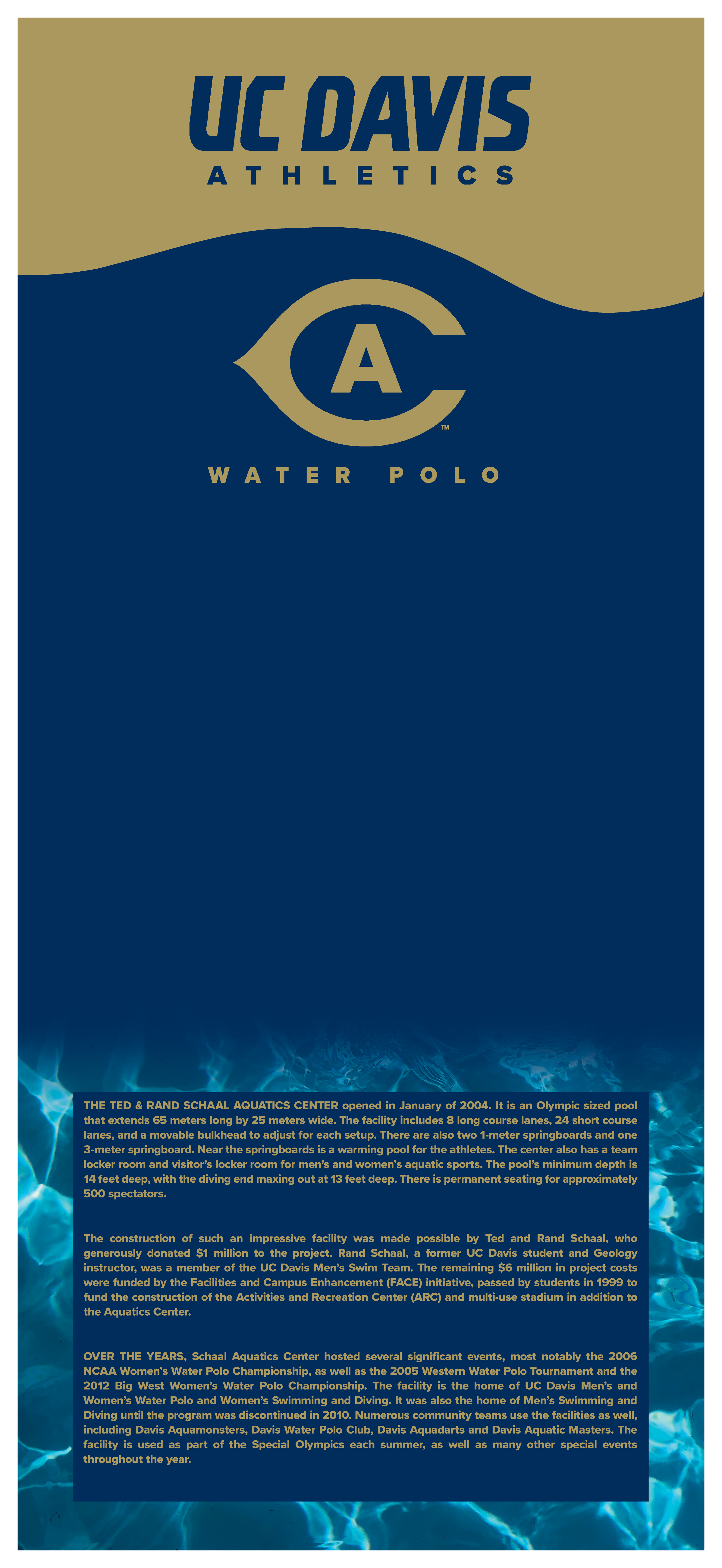
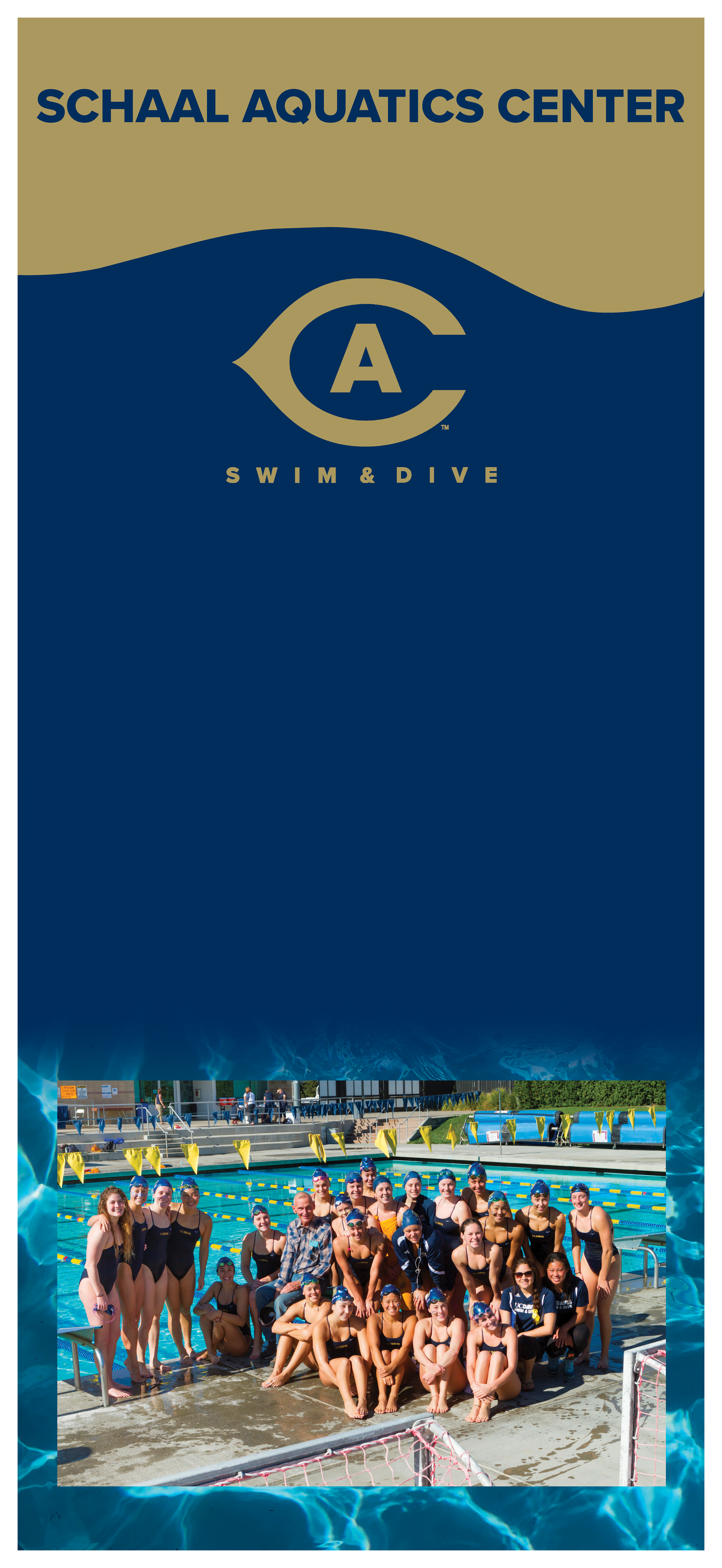
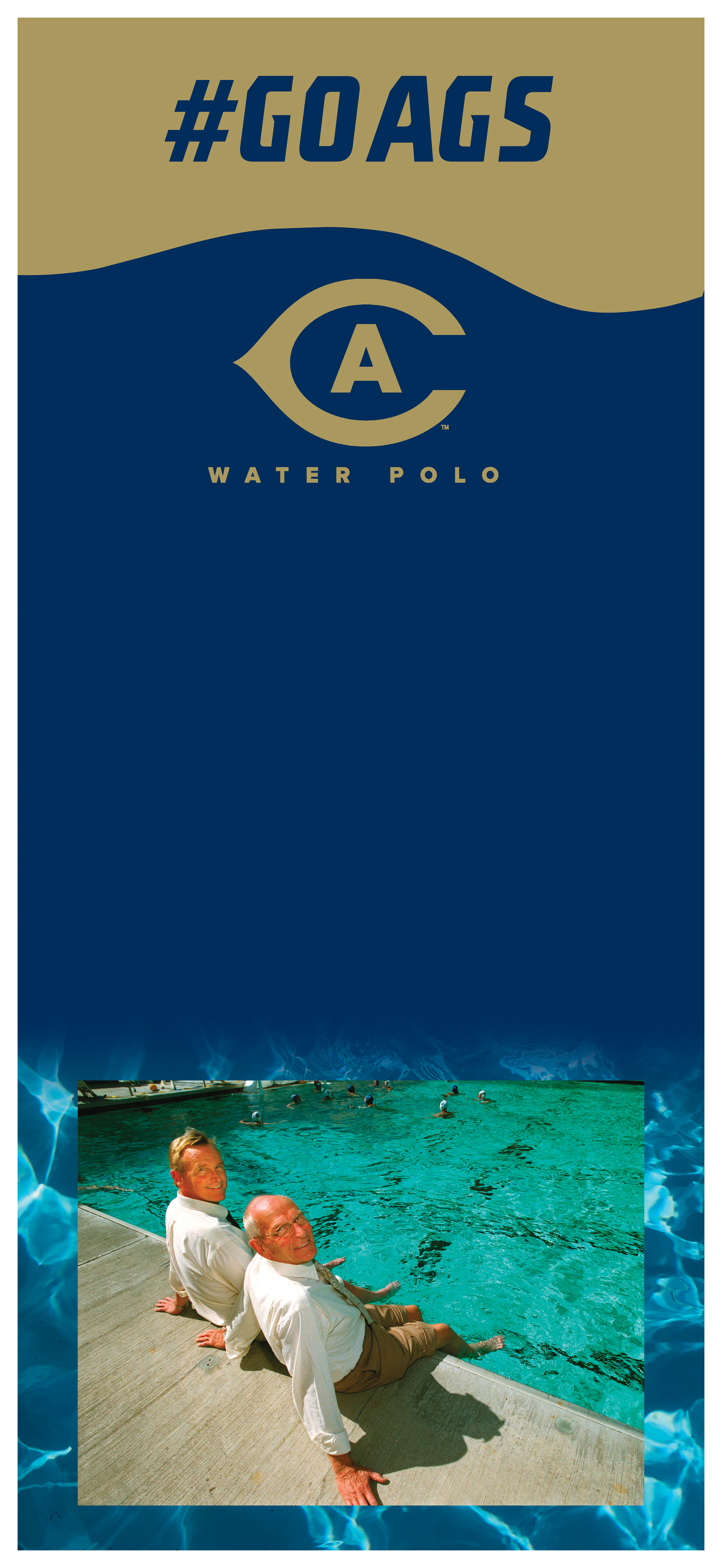
The hardest part of this redesign was trying to come up with a fresh new look for these posters while also staying within the UC Davis brand guidelines, as well as trying to fit in all of the important information into the text box that you see in the left poster.
Admittedly, it took me many tries to get it just right, but, eventually, I found the best solution.
Ultimately, the redesign was a success -- it turned out better than I could have hoped once it was printed (see image below), and I received high praise from the coaches and staff who would see it the most often.
